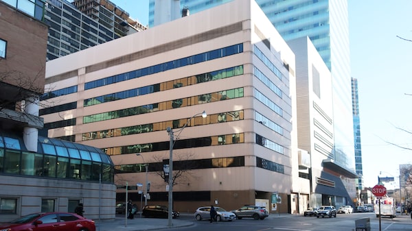
The Elizabeth McMaster building was state of the art when it opened in 1986.Wallace Immen/The Globe and Mail
Little more than 30 years after it opened on the Hospital for Sick Children campus, an eight-storey building is already history, demolished to make way for SickKids’ new Patient Support Centre that will be three times larger.
The Elizabeth McMaster building – named for a founder of SickKids – was state of the art when it opened in 1986, but it couldn’t easily adapt to the hospital’s exponential growth and modern workplace needs. It’s an issue facing many commercial buildings that went up at the dawn of the computer revolution, explains Peter Goldthorpe, vice-president of transformation for SickKids.
It was purpose-built as a laboratory and research building, but when the hospital’s new Peter Gilgan Centre for Research and Learning was built to the east of the McMaster Building, the lab and research programs moved there. The hospital considered converting the building to offices for administrators and support teams currently scattered through hospital buildings that need to be vacated for future hospital expansions as well as rental office spaces around the campus.
“But it would have cost more to gut and repurpose than to tear down and start over,” Mr. Goldthorpe says. The building would be too costly to convert and was not energy efficient. Because it was only eight storeys high, it was also much too small to accommodate the administrative needs going forward.

SickKids Patient Support Centre site looking west toward the hospital's atrium addition.Wallace Immen/The Globe and Mail
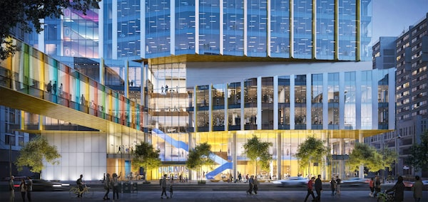
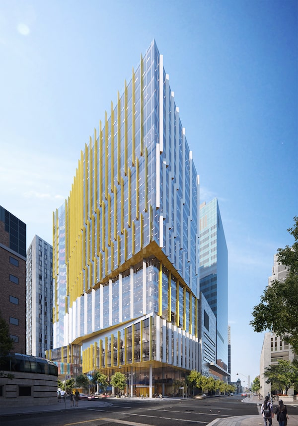
A 22-storey Patient Support Centre taking its place will be a dramatic and colourful showplace on formerly bland Elizabeth Street, one block east of the main hospital complex. The glass-clad building is designed to be uplifting as well as educational, allowing patients to see how the doctors and staff move around the building, says Patrick Fejér, project lead and senior design principal for B+H Architects. Vibrant colours and twists in the façade at the third and sixth floors will highlight its multiple functions as a teaching, research and medical office complex above a public galleria. Horizontal fins between the glass panels will provide shading and optimize thermal efficiency. A key feature will be a multicoloured staircase encased in glass, which will run all the way to the top floor and be visible from the street.

Offsets in lower floor identify different uses in Patient Support CentreSupplied
A guiding principle was to provide as much natural light as possible into the building, Mr. Fejér says. The elevator banks are purposely located at the north end of the building to allow as much sunlight into the rest of the tower. The lower levels will be publicly accessible, including a reception area and café, conference rooms and a library. There will be a rooftop green space and public patio, with a protective curtain wall to deflect wind.
Two below-grade levels will house a unique simulation centre that will replicate real-life care scenarios. Run by the hospital’s Learning Institute, it will use the latest virtual-reality technologies, including lifelike simulation dolls that can breathe and cry to train staff, as well as parents and families, in skills to care for patients at home.
The building will become home to as many as 3,000 staff in 60 departments and divisions. The hospital would have liked to build taller to accommodate more, but there is a height limit on the site, Mr. Fejér says. The city requires a clear vista to the north from iconic City Hall. That meant the building could only rise to a maximum of 22 storeys. The roof is actually angled up to the north end to keep below the sightline and still accommodate the elevator bay.

Project phases redevelopment of SickKidsThe Globe and Mail
“By co-locating clinicians, researchers and educators, we will have an amazing opportunity to drive innovation and improve services,” Mr. Goldthorpe says. “The interior design is being set up in a way that will encourage spontaneous interactions between people that we hope will lead to better collaboration and new discoveries.” The goal is to more quickly translate ideas from research to front-line clinical care through the building, he adds.
Interiors are being designed from the results of a series of collaborative visioning and planning sessions with the SickKids team as well as input from surveys of what staff would like to see in their workspaces. To test potential office layouts, a prototype floor has been set up in an office building to the south of the hospital. Representatives of different departments and divisions are using the pilot space and giving their feedback.

A glass-enclosed bridge will connect SickKids PSC with the main hospital.Supplied
The office concept is modular rather than open concept, with a variety of spaces able to be reconfigured according to needs. Groups can choose to have more closed rooms or more open spaces that can be altered depending on the project, Mr. Fejér explains. There will be several sizes of bookable rooms around communal areas that can be furnished in several ways, from a boardroom table to casual couches to more formal desks. Walls can be relocated to make the spaces larger if required. Certain spaces for physicians and clinicians will be soundproofed for confidentiality.
The teams are also testing advanced mobile technologies, including a small device that can be plugged into a laptop that can project onto a wall or screen and make it easier to have spontaneous meetings. SickKids is also significantly reducing the use of paper and less space for filing will be required in the new facility.

A rendition of the new SickKids lobby designed by B+H architects.Rendering by B+H Architects
The new designs will accommodate more people per floor than in traditional hospital offices where everyone had assigned spaces. Utilization of space in hospitals is often very low; people may be in their assigned spaces as little as 20 per cent of the time because they’re moving around, studies have found. “Creating a more activity-oriented space in different configurations to accommodate different styles of working, we can accommodate a lot more people per floor without it feeling like it’s more compact,” Mr. Fejér says.
Construction over the next three years will pose logistical challenges in busy midtown Toronto. Within five city blocks, there are another half-dozen residential and commercial projects also under construction. B+H is the design architect and prime consultant for the project with Entuitive Consulting Engineers as structural specialists. The Mitchell Partnership Inc. is designing the mechanicals and Mulvey & Banani International Inc. is doing electrical engineering.
The project with an estimated cost of $400-million is the first phase in SickKids’ ambitious Project Horizon, a decade-long program that will transform the entire hospital complex.

The project with an estimated cost of $400-million is the first phase in SickKids' ambitious Project Horizon.Rendering by B+H architects
The second phase planned is The Peter Gilgan Family Patient Care Tower, a new acute-care hospital tower to house critical care and in-patient units, that will replace current hospital wings on University Avenue. A third phase will see renovations of other buildings in the campus.
The Ontario government announced a $2.4-billion commitment to Project Horizon in 2018, but planning is still in early stages and it’s still difficult to say what the total cost of the project will be, Mr. Goldthorpe says.
In addition, the SickKids Foundation’s SickKids VS Limits campaign announced in October, 2019, that it has already reached three-quarters of its announced fundraising goal of $1.3-billion, the largest in Canadian health-care history, to reimagine the campus as well as support breakthrough pediatric health research and establish partnerships for better patient care.
SickKids’ new showpiece
The Hospital for Sick Children’s new Patient Support Centre is designed to be inspirational as well as being a comfortable and energy-efficient working environment. Here are some key features:
- Energy-efficient glass curtain wall with adjustable fins to shade direct sunlight
- Access to natural light from east, south and west
- Soothing, colourful décor, including multicoloured staircase visible from the street
- Occupancy and daylight sensors for LED lighting
- Rainwater collection system for green roof and toilet flushing
- Low flow and waterless fixtures for water conservation
- District-energy system steam heating and cooling from deep lake water
- Secure below-grade bicycle parking