The listing: 117 Glen Rd.
Asking price: $11,600,000
Taxes: $43,803.25 (2016)
Lot size: 85.42 by 304 feet
Agents: Gillian Oxley and Joseph Roberts, Royal LePage Johnston & Daniel Division, Brokerage

When the Royal Ontario Museum unveiled its plans for an architecturally modern addition, it illustrated to the public how hard it is to take something old and give it a new update.
Beth Leon faced a similar dilemma when she and her husband, David, decided to renovate their century-old Rosedale mansion. But instead of turning to ROM’s Michael Lee-Chin Crystal as inspiration, they looked to the National Ballet School of Canada, located on Jarvis Street in Toronto.
“The original plan was we wanted to do something very, very modern,” Ms. Leon said. “We wanted to put, like, a modern cube attached to the old house.”
The problem was the neighbourhood – in the form of the local ratepayers’ group – wasn’t having it.

The Back Story
Before the plan to reimagine 117 Glen Rd. was set in motion, it was a traditional turn-of-the-20th-century brick mansion. Ms. Leon happened upon it while searching for a new home in 2012. There was one problem with it, though. “It was extremely unattractive,” she said, explaining that an interior renovation had left the house feeling very dated.
But there was potential because of the structure and the way the house was positioned on one side of the lot.
“When you look back at the 1900s, the homes in wealthier neighbourhoods tend to be close together on one side,” agent Gillian Oxley said. “They did that so you didn’t have horses and carriages going in-between both sides of your house.”

All of the space on the south end of the lot provided Ms. Leon with an opportunity. With the help of Stuart Watson and William Mockler from Drawing Room Architects Inc., they came out with a few different designs that added a glass cube to the side of the home. But because the home has historical importance (it’s has a “C” designation with Heritage Toronto), they had to get the ratepayers’ association’s approval first. And they didn’t get it. But that didn’t upset Ms. Leon.
“When we started with the modern cube on the side of the house, that wasn’t really working for me. It was a really hard concept for me to swallow,” she said. “It looked like I was wearing my jeans to the party with a fascinator on my head.
“And I hate fascinators.”

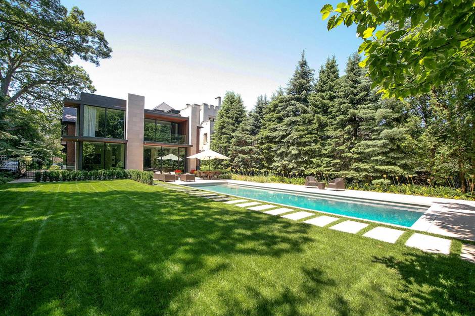
So Mr. Mockler and Mr. Watson tried again and came up with the “visually intriguing” compromise of today. From the street, you’d never know the addition was an add-on. The front of it is brick, perfectly matched to the original house. But on the backside, it’s glass, oxidized zinc metal features and limestone pillars.
“The [addition] is genius because it made the house fit the lot,” Ms. Oxley said.
Inside the house, the architects redesigned everything, providing a floor plan that focused on flowing but distinct spaces for entertaining on the main floor and five bedrooms on the second and third floors. The lower level contains another bedroom, an office, a media room, an exercise room and a yoga studio. (The home has three two-piece washrooms and six full bathrooms.)

Given that this was her fourth time leading a renovation project of her home, Ms. Leon knew exactly what she wanted.
From an aesthetic point of view, she went for a minimalist clean look with modern finishes. She worked with interior designer Danielle Josette to think through every detail from the integrated, hidden curtain rods tucked up in the ceiling to to the floating drywall walls to the lighting needed to highlight the family’s extensive art collection.
“I really wanted things to be clean and simple because I came from a house where we had big mouldings and big baseboards. It was over-the-top ornamentation,” Ms. Leon said. “I wanted this to be completely the opposite.”

Favourite Features
One of the most striking modern features in the house are the floors on the main and lower levels. They are concrete but finished with Panmodo, a glaze-type material that can be swirled into a pattern but is smooth to touch.
Other high-end finishes include the washroom vanities made out of onyx – a translucent stone that features coloured striations, acid-etched cement in the back patio and rosewood herringbone flooring in the dining room (a nod to the historic character of the original home).
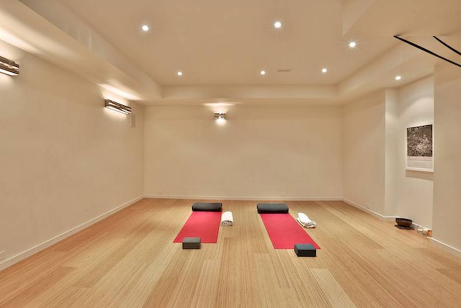
But for Ms. Leon, her favourite space is her yoga studio, where she teaches private classes four times a week. A lover of yoga, she estimates she spends three to four hours in there a day. It was designed to her specifications, including a bamboo floor and a swing in one corner, that allows participants to hang upside down without putting pressure on their head.

“I love my yoga studio. It’s like my nest. It’s sort of sacred to me,” she said. “If I could take it with me, I would.”
For Ms. Oxley, the best spot in the house is in the kitchen looking out on the backyard through the floor-to-ceiling windows of the addition.
“The kitchen area – the whole back of the house – is so peaceful,” Ms. Oxley said. “I think that what Beth and David has done with this renovation is give this house back its life and brought it into today.
“It’s a respectful nod to the past and a great celebration of architecture today.”